
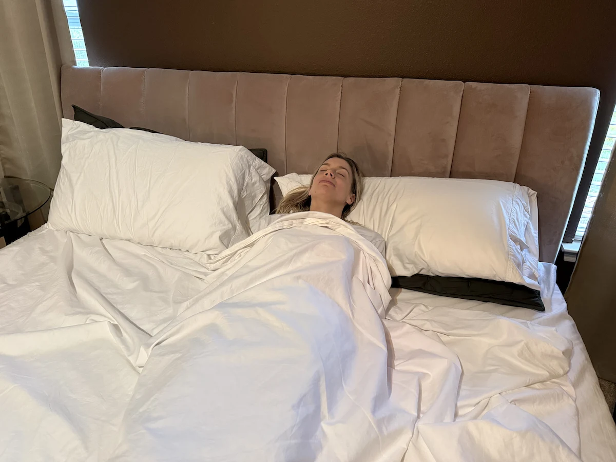
Sleep is one of the most important biological functions for human health, affecting everything from brain performance and mood to immune function and cardiovascular wellness. While factors such as mattress quality, room temperature, noise levels, and bedtime routines often receive attention, one surprisingly powerful influence on sleep is color.
The colors that surround us can affect our emotions, stress levels, energy, and even physiological responses. Color psychology has been studied for decades, revealing that certain colors can promote relaxation and calmness while others stimulate alertness and activity. Because of these effects, the colors used in bedrooms, bedding, lighting, and décor can play a meaningful role in creating an environment that supports healthy sleep.
Many people spend significant amounts of money on sleep aids, blackout curtains, white noise machines, and specialized mattresses, yet overlook the influence of color. The right color choices can transform a bedroom into a peaceful retreat that encourages relaxation and prepares the mind and body for restorative rest.
This comprehensive guide explores the relationship between color and sleep, examines the best colors for promoting rest, discusses colors that may interfere with sleep, and offers practical tips for designing a sleep-friendly bedroom environment.
Understanding the Psychology of Color
Color psychology refers to the study of how different colors affect human emotions, behaviors, and perceptions.
Although responses to color can vary based on culture, personal experiences, and preferences, researchers have found several common patterns in how people react to specific colors.
Colors can influence:
- Heart rate
- Blood pressure
- Mood
- Stress levels
- Energy
- Attention
- Relaxation
For example:
- Red is often associated with excitement and stimulation.
- Yellow is linked to energy and optimism.
- Blue is commonly associated with calmness and serenity.
- Green is connected to nature and balance.
Because sleep requires a relaxed physical and mental state, understanding how colors influence emotions can help create an environment conducive to rest.
Read More: How To Reset Your Circadian Rhythm | Bedroom Temperature For Better Sleep | How Weighted Blankets Work Scientifically | Does the Purple Mattress Sleep Cool?
How Color Affects Sleep
The connection between color and sleep involves both psychology and physiology.
Colors can influence:
Emotional State
Certain colors create feelings of calmness and security, making it easier to unwind before bed.
Perceived Temperature
Colors can affect whether a room feels warm or cool.
For example:
- Blue often feels cooler.
- Red and orange often feel warmer.
Since cooler environments generally support better sleep, cooler colors may contribute to a more restful atmosphere.
Stress Levels
Calming colors can reduce stress and anxiety, which are common obstacles to falling asleep.
Light Exposure
Colored lighting can affect circadian rhythms and melatonin production.
Exposure to certain wavelengths of light, particularly blue light from screens, can suppress melatonin and delay sleep onset.
This makes both room color and lighting choices important considerations.
Why Bedroom Colors Matter
The bedroom serves as a place for rest, recovery, and relaxation.
Every visual element contributes to the overall atmosphere, including:
- Wall colors
- Furniture finishes
- Bedding
- Curtains
- Artwork
- Lighting
When these elements feature calming colors, the environment may encourage relaxation and improve sleep quality.
Conversely, overly stimulating colors can make it harder to unwind.
A thoughtfully designed bedroom can act as a signal to the brain that it is time to rest.
The Best Colors for Sleep
Blue: The Most Sleep-Friendly Color
Blue is widely regarded as one of the best colors for promoting sleep.
Studies and surveys have consistently found that people often associate blue bedrooms with better sleep quality.
Blue is linked to:
- Calmness
- Peace
- Stability
- Serenity
- Relaxation
Soft shades of blue may help:
- Lower stress
- Reduce mental stimulation
- Create a tranquil environment
Popular sleep-friendly shades include:
- Sky blue
- Powder blue
- Mist blue
- Pale aqua
- Dusty blue
Blue also evokes images of:
- Clear skies
- Calm oceans
- Gentle water
These associations may contribute to its relaxing effects.
Green: Nature’s Relaxing Color
Green is another excellent color for sleep.
Associated with nature, growth, and harmony, green can create a sense of balance and restoration.
Benefits of green include:
- Reduced stress
- Visual comfort
- Emotional stability
- Relaxation
Because green sits in the middle of the visible color spectrum, the human eye processes it easily, making it one of the least fatiguing colors to view.
Ideal sleep-friendly shades include:
- Sage green
- Olive green
- Moss green
- Pale eucalyptus
- Soft mint
Green bedrooms often feel peaceful and grounding, helping occupants transition into a relaxed state before bedtime.
Soft Gray: A Modern Sleep Solution
Gray has become increasingly popular in bedroom design.
When used correctly, soft gray creates:
- Sophistication
- Calmness
- Simplicity
- Comfort
Light gray tones work particularly well when paired with:
- White
- Beige
- Blue accents
- Natural wood
However, very dark gray can sometimes create a gloomy atmosphere if not balanced with lighter elements.
For sleep-friendly environments, consider:
- Warm gray
- Dove gray
- Silver gray
- Mist gray
These softer shades create a soothing backdrop without overstimulation.
Beige and Taupe: Neutral and Comforting
Neutral colors are often excellent choices for sleep environments.
Beige and taupe offer:
- Warmth
- Simplicity
- Comfort
- Relaxation
These colors create a cozy atmosphere without drawing excessive attention.
Benefits include:
- Versatility
- Timeless appeal
- Compatibility with many design styles
Soft neutral bedrooms often feel inviting and restful, making them ideal for relaxation.
Popular shades include:
- Sand beige
- Creamy beige
- Warm taupe
- Mushroom tones
Lavender: Gentle and Calming
Lavender combines the calming properties of blue with the softness of purple.
This color is often associated with:
- Relaxation
- Tranquility
- Serenity
- Luxury
Light lavender shades can create a soothing environment that encourages rest.
Because darker purples may feel dramatic or stimulating, softer tones generally work best for bedrooms.
Good options include:
- Lavender mist
- Lilac
- Dusty lavender
- Pale violet
These shades add personality while maintaining a peaceful atmosphere.
White: Clean and Peaceful
White symbolizes:
- Purity
- Simplicity
- Freshness
- Calmness
A white bedroom can feel bright, open, and peaceful.
However, pure stark white may sometimes feel clinical or sterile.
To create a warmer sleep environment, many designers recommend:
- Off-white
- Ivory
- Cream
- Soft white
These variations maintain the calming qualities of white while adding warmth and comfort.
Soft Pink: A Surprisingly Relaxing Choice
Many people overlook pink when considering sleep-friendly colors.
Soft pink shades can create feelings of:
- Comfort
- Warmth
- Security
- Calmness
Particularly effective shades include:
- Blush pink
- Rose beige
- Dusty pink
- Pale peach-pink
These colors can soften a bedroom’s atmosphere and contribute to a sense of relaxation.
Earth Tones and Natural Colors
Natural colors inspired by landscapes often support relaxation.
Examples include:
- Clay
- Sand
- Stone
- Driftwood
- Soft terracotta
- Warm brown
These colors create a connection with nature and often promote feelings of comfort and stability.
Earth-toned bedrooms frequently feel grounded and welcoming.
Colors That May Interfere With Sleep
While color preferences are personal, some colors may be less conducive to sleep due to their stimulating nature.
Red
Red is one of the most energizing colors.
It is associated with:
- Passion
- Excitement
- Energy
- Urgency
Research suggests that red may increase:
- Alertness
- Heart rate
- Emotional intensity
Although red can be attractive as an accent color, using it extensively in a bedroom may make relaxation more difficult.
Bright Orange
Orange is energetic and cheerful.
While suitable for exercise rooms or creative spaces, bright orange can feel stimulating in a sleep environment.
Large amounts of orange may promote alertness rather than restfulness.
Bright Yellow
Yellow is often associated with happiness and positivity.
However, highly saturated yellow can become overwhelming and visually stimulating.
Bright yellow may contribute to:
- Mental activity
- Increased alertness
- Difficulty relaxing
Muted yellow shades tend to work better than vivid tones.
Neon Colors
Neon shades of:
- Green
- Pink
- Yellow
- Orange
can create visual excitement that interferes with relaxation.
These colors generally work better in recreational or creative spaces rather than bedrooms.
Bright Purple
While lavender can be calming, highly saturated purple may feel dramatic and stimulating.
Deep royal purples often create a sense of luxury but may not promote the same tranquility as lighter variations.
The Role of Lighting and Color
Color perception changes dramatically depending on lighting conditions.
A paint color that appears calming during the day may look very different at night.
Factors affecting color appearance include:
- Natural sunlight
- LED lighting
- Incandescent bulbs
- Lamp placement
- Color temperature
Warm lighting generally complements sleep-friendly colors better than cool lighting.
Ideal bedtime lighting often falls within warm color temperatures that create a cozy atmosphere.
Color, Light, and the Circadian Rhythm
To fully understand how colors influence sleep, it is important to understand the body’s internal clock, known as the circadian rhythm.
The circadian rhythm is a 24-hour biological cycle that regulates:
- Sleep and wakefulness
- Hormone production
- Body temperature
- Metabolism
- Alertness levels
One of the primary hormones involved in sleep regulation is melatonin. Melatonin production typically increases in the evening as darkness approaches and decreases in the morning when exposed to light.
While wall colors themselves do not directly alter melatonin production, the colors of light we are exposed to can have a significant impact.
Blue Light and Sleep
Blue light has become one of the most discussed topics in sleep science.
Sources of blue light include:
- Smartphones
- Tablets
- Computers
- Televisions
- LED lighting

Exposure to blue light during the evening can suppress melatonin production, making it more difficult to fall asleep.
Research suggests that excessive nighttime exposure to blue wavelengths may:
- Delay sleep onset
- Reduce sleep quality
- Disrupt circadian rhythms
- Increase nighttime alertness
This creates an interesting distinction:
- Soft blue wall colors can be calming.
- Blue light emitted from screens can be stimulating.
Understanding this difference is essential when designing a sleep-friendly environment.
Warm Light for Better Sleep
Sleep experts generally recommend warm-colored lighting during the evening.
Warm lighting often appears:
- Soft yellow
- Amber
- Golden
- Warm white
These lighting tones create a relaxing atmosphere and are less likely to interfere with melatonin production.
Many modern smart bulbs offer settings specifically designed for evening relaxation.
The Relationship Between Color and Emotion
Humans naturally form emotional associations with colors throughout life.
These associations can stem from:
- Nature
- Cultural influences
- Personal experiences
- Marketing
- Environmental conditioning
For example:
- Blue may remind someone of a peaceful beach vacation.
- Green may evoke memories of forests and gardens.
- Beige may create feelings of warmth and security.
Because emotions strongly influence sleep quality, these subconscious associations matter.
When selecting bedroom colors, it is often beneficial to choose shades that personally evoke comfort and calmness.
Best Bedroom Color Combinations for Sleep
Individual colors matter, but color combinations often determine the overall atmosphere of a room.
Certain combinations create especially restful environments.
Blue and White
Blue and white remains one of the most popular sleep-friendly combinations.
Benefits include:
- Clean appearance
- Visual simplicity
- Calm atmosphere
- Timeless style
This combination often evokes coastal and spa-inspired environments that encourage relaxation.
Sage Green and Cream
Sage green paired with cream creates a natural, soothing aesthetic.
This combination offers:
- Warmth
- Softness
- Balance
- Organic appeal
Many wellness-focused interior designers recommend this pairing for bedrooms.
Gray and Soft Blue
Combining light gray with pale blue creates a serene, modern appearance.
Benefits include:
- Reduced visual clutter
- Contemporary design
- Relaxing atmosphere
- Excellent versatility
This combination works particularly well in minimalist bedrooms.
Beige and White
Neutral palettes often feel calming because they avoid visual overstimulation.
Beige and white provide:
- Warmth
- Comfort
- Simplicity
- Timeless elegance
These tones can create a cozy retreat-like atmosphere.
Lavender and Gray
Lavender paired with gray creates a soft and sophisticated environment.
The combination offers:
- Tranquility
- Subtle color
- Relaxation
- Visual harmony
Many people find this pairing especially appealing in bedrooms designed for stress reduction.
Best Bedding Colors for Sleep
Walls are important, but bedding is often the last thing people see before falling asleep and the first thing they see when waking up.
Choosing calming bedding colors can reinforce a restful atmosphere.
Recommended bedding colors include:
- White
- Ivory
- Light blue
- Sage green
- Soft gray
- Beige
- Dusty lavender
These colors tend to feel calm and inviting.
Layering multiple complementary colors can also add visual comfort without creating overstimulation.
For example:
- White sheets
- Sage duvet cover
- Gray accent pillows
This creates visual interest while maintaining serenity.
Best Curtain Colors for Better Sleep
Curtains influence both color perception and light control.
Effective sleep-friendly curtain colors include:
- Navy blue
- Charcoal gray
- Soft beige
- Forest green
- Taupe
Blackout curtains are especially useful because they:
- Block external light
- Support melatonin production
- Improve sleep consistency
Combining blackout functionality with calming colors provides both practical and psychological benefits.
Colors for People With Insomnia
Individuals who struggle with insomnia often benefit from environments designed to minimize stimulation.
Recommended colors include:
Pale Blue
Pale blue may help create feelings of safety and tranquility.
Sage Green
Nature-inspired greens can reduce stress and promote calmness.
Warm Gray
Soft gray tones create visual simplicity without feeling cold.
Cream
Cream colors add warmth while remaining gentle on the eyes.
Muted Lavender
Lavender’s calming reputation makes it popular among those seeking restful environments.
For people with insomnia, avoiding overly bright or saturated colors may be especially important.
Colors for Children’s Bedrooms
Children’s sleep environments require special consideration.
Many children’s rooms are decorated with bright, energetic colors that may inadvertently increase stimulation.
While playful colors can certainly be incorporated, sleep areas often benefit from softer tones.
Good choices include:
- Sky blue
- Mint green
- Soft yellow
- Light lavender
- Pale peach
These colors maintain a cheerful appearance while supporting relaxation.
Colors for Teen Bedrooms
Teenagers often prefer more personalized spaces.
Sleep-friendly options include:
- Dusty blue
- Muted green
- Soft gray
- Warm beige
- Deep navy accents
These colors create mature environments while remaining conducive to sleep.
Colors for Adults Seeking Better Sleep
Adults often face sleep challenges related to:
- Stress
- Work demands
- Parenting responsibilities
- Technology use
Colors that promote calmness may help offset some of these challenges.
Popular adult bedroom colors include:
- Sage green
- Dusty blue
- Warm taupe
- Soft gray
- Cream
Many luxury hotels use these colors because they create universally relaxing environments.
Hotel Design and Sleep Psychology
Hotels invest heavily in sleep-friendly design because guest satisfaction often depends on sleep quality.
Common hotel bedroom colors include:
- Beige
- Taupe
- Soft gray
- Blue
- Cream
These colors are chosen because they appeal to a broad range of people and rarely feel overwhelming.
Many hotel designers intentionally avoid bright colors in sleeping areas to encourage relaxation.
Color and Stress Reduction
Stress is one of the leading causes of sleep difficulties.
The right colors may help reduce perceived stress by creating a calming environment.

Relaxing colors often:
- Slow visual processing
- Reduce sensory overload
- Create feelings of safety
- Encourage mental decompression
This can be particularly beneficial after demanding workdays.
The Influence of Nature-Inspired Colors
Humans often respond positively to colors found in natural environments.
Examples include:
- Forest green
- Sky blue
- Sandy beige
- Stone gray
- Ocean teal
Researchers have suggested that exposure to nature-inspired elements may reduce stress and improve emotional well-being.
Bringing these colors into a bedroom can create a similar effect.
Minimalism and Color Simplicity
Modern sleep-focused design frequently embraces minimalism.
Minimalist bedrooms often feature:
- Neutral palettes
- Limited color variation
- Clean lines
- Reduced clutter
Visual simplicity may help reduce mental stimulation and encourage relaxation.
This does not mean bedrooms must be boring.
Instead, a few carefully chosen calming colors often create a stronger sense of peace than numerous competing shades.
The Importance of Personal Preference
Although general color psychology offers useful guidelines, personal preference remains important.
A color that feels calming to one person may feel unpleasant to another.
For example:
- Someone who loves the ocean may find blue deeply relaxing.
- Someone with negative associations may not.
When selecting sleep-friendly colors, consider both psychological research and personal emotional responses.
The most effective bedroom color is often one that combines established calming qualities with individual comfort and preference.
Seasonal Color Considerations
Some people enjoy adjusting their bedroom décor seasonally.
Examples include:
Spring:
- Soft green
- Pale yellow
- Light floral accents
Summer:
- Sky blue
- White
- Aqua
Autumn:
- Warm taupe
- Muted terracotta
- Soft olive
Winter:
- Cream
- Gray
- Dusty blue
These subtle changes can keep a bedroom feeling fresh while maintaining a relaxing atmosphere.
Color and Mental Health
Mental health and sleep are closely connected.
Poor sleep can worsen:
- Anxiety
- Depression
- Stress
- Mood instability
Likewise, psychological distress can make sleep more difficult.
Creating a calming color environment may support emotional well-being by reducing sensory stress and promoting relaxation.
While color alone cannot treat mental health conditions, it can contribute to a healthier sleep environment that supports overall wellness.
Feng Shui Perspectives on Colors and Sleep
For centuries, Feng Shui practitioners have emphasized the importance of environmental design in promoting health, harmony, and restful sleep.
Feng Shui is an ancient Chinese practice focused on balancing energy within a living space. While not all of its principles are supported by scientific research, many people find its recommendations helpful when creating a relaxing bedroom environment.
According to Feng Shui principles, colors represent different elements:
- Blue represents water.
- Green represents wood.
- Red represents fire.
- Yellow represents earth.
- White represents metal.
For sleep-focused spaces, Feng Shui often favors softer, more balanced tones rather than highly stimulating colors.
Commonly recommended bedroom colors include:
- Soft blues
- Sage greens
- Warm neutrals
- Cream tones
- Light earth colors
The goal is to create an atmosphere that feels secure, balanced, and peaceful.
Scientific Research on Colors and Sleep
Although sleep quality depends on many factors, researchers have explored how color influences mood, stress levels, and environmental comfort.
Several findings have emerged:
Calming Colors Reduce Stress
Studies consistently show that cooler and softer colors tend to evoke lower levels of stress and anxiety compared to highly saturated colors.
Because stress is a major contributor to insomnia and poor sleep, reducing environmental stressors may improve rest.
Nature-Based Colors Promote Relaxation
Research on environmental psychology suggests that colors associated with natural environments often contribute to feelings of calmness and restoration.
This helps explain why greens and blues frequently rank among the most relaxing colors.
Bright Colors Increase Stimulation
Colors with high saturation levels often create greater mental engagement and sensory stimulation.
While this may be beneficial in workplaces or exercise spaces, it may be less desirable in bedrooms.
Personal Associations Matter
Researchers also emphasize that individual experiences influence color perception.
Two people may react very differently to the same color based on memories, culture, and personal preference.
This is why color psychology should be viewed as a helpful guideline rather than a universal rule.
Paint Finish and Sleep-Friendly Design
Color is important, but paint finish also affects how a room feels.
Different finishes reflect light differently.
Matte Finish
Matte finishes absorb more light and create a softer appearance.
Benefits include:
- Reduced glare
- Softer atmosphere
- Relaxed visual effect
Many designers consider matte paint ideal for bedrooms.
Eggshell Finish
Eggshell finishes provide slightly more durability while maintaining a relatively soft appearance.
This is a popular compromise between practicality and aesthetics.
Glossy Finishes
Glossy finishes reflect more light and create greater visual stimulation.
While useful in some areas of the home, they may not contribute to the calmest sleep environment.
The Impact of Color Saturation
When discussing sleep-friendly colors, saturation is often just as important as color choice.
For example:
A soft sage green may feel calming.
A neon green may feel stimulating.
A pale blue may feel relaxing.
An electric blue may feel energizing.
Lower saturation levels generally create more restful environments because they are gentler on the eyes and less visually demanding.
Best Accent Colors for Sleep-Friendly Bedrooms
Accent colors add interest and personality without overwhelming the room.
Good accent colors include:
- Dusty blue
- Soft olive
- Muted lavender
- Warm taupe
- Pale blush
- Natural wood tones
These accents can be incorporated through:
- Pillows
- Throws
- Artwork
- Lamps
- Decorative accessories
Using accents sparingly helps maintain a calming atmosphere.
Common Bedroom Color Mistakes
Many people unintentionally choose colors that work against restful sleep.
Choosing Overly Bright Colors
Highly saturated colors can feel exciting rather than relaxing.
Examples include:
- Bright red
- Neon yellow
- Electric blue
- Vivid orange
These colors may increase visual stimulation and make winding down more difficult.
Using Too Many Colors
A bedroom filled with numerous competing colors can create visual clutter.
This may contribute to mental overstimulation rather than relaxation.
Most sleep-friendly rooms use a limited color palette.
Ignoring Lighting
A color that appears beautiful in a store may look very different under bedroom lighting.
Always test paint samples under:
- Daylight
- Evening lighting
- Artificial light sources
before committing to a color.
Following Trends Blindly
A trendy color is not necessarily the best choice for sleep.
Personal comfort should take priority over design trends.
How to Choose the Best Sleep Color for Your Personality
Different personalities often gravitate toward different colors.
For People Who Prefer Calm and Quiet
Consider:
- Pale blue
- Sage green
- Cream
- Light gray
For People Who Enjoy Warmth and Comfort
Consider:
- Beige
- Taupe
- Soft brown
- Warm ivory
For People Who Like Modern Design
Consider:
- Gray
- White
- Muted blue
- Charcoal accents
For Nature Lovers
Consider:
- Olive green
- Sage green
- Moss green
- Earth tones
Choosing colors that align with your personality can increase comfort and satisfaction.
Creating a Complete Sleep-Friendly Color Scheme
The most effective bedroom environments consider every visual element.
Components include:
Walls
Choose calming, low-saturation colors.
Bedding
Coordinate with wall colors while maintaining softness.
Curtains
Select colors that support relaxation and block unwanted light.
Furniture
Natural wood and neutral finishes often complement sleep-friendly palettes.
Lighting
Use warm-toned bulbs during evening hours.
Accessories
Keep decorative accents subtle and cohesive.
Together, these elements create a unified environment that encourages rest.
Color and Sleep Across Different Cultures
Color symbolism varies significantly around the world.
For example:
- White symbolizes purity in some cultures.
- White symbolizes mourning in others.
- Red may represent luck and prosperity in some societies.
- Red may represent danger or urgency in others.
Because cultural experiences influence emotional responses, color preferences often differ between individuals and regions.
Despite these differences, softer and less stimulating shades generally remain popular choices for bedrooms worldwide.
Can Changing Bedroom Colors Really Improve Sleep?
Changing bedroom colors alone is unlikely to solve serious sleep disorders.
However, environmental factors can contribute meaningfully to sleep quality.
A relaxing bedroom color scheme may help by:
- Reducing stress
- Creating a sense of comfort
- Supporting relaxation
- Encouraging bedtime routines
- Enhancing overall bedroom satisfaction
Small improvements in multiple areas often add up to meaningful gains in sleep quality.
Combining Color With Other Sleep Strategies
Color works best when combined with proven sleep habits.

These include:
- Maintaining a consistent bedtime
- Limiting screen exposure before bed
- Keeping the room cool
- Reducing noise
- Using comfortable bedding
- Avoiding excessive caffeine late in the day
- Practicing relaxation techniques
Together, these strategies create a comprehensive approach to better sleep.

Future Research on Color and Sleep
Interest in sleep science continues to grow.
Future research may explore:
- Individual color preferences
- Neurobiological responses to color
- Personalized bedroom design
- Smart lighting systems
- Color therapy applications
As technology advances, researchers may gain deeper insight into how environmental colors influence sleep and overall wellness.
Frequently Asked Questions
What is the best color for sleep?
Blue is often considered the most sleep-friendly color because it is associated with calmness, relaxation, and tranquility.
Is green good for sleep?
Yes. Green is linked to nature, balance, and harmony, making it one of the best colors for a restful bedroom.
Can bedroom colors affect sleep quality?
Colors can influence mood, stress levels, and relaxation, all of which can impact sleep quality.
Is gray a good bedroom color?
Soft gray can be an excellent choice because it creates a calm, sophisticated, and relaxing environment.
Should I avoid red in the bedroom?
Large amounts of bright red may feel stimulating and energetic, making it less suitable for sleep-focused spaces.
Is white a good color for sleep?
Soft white, ivory, and cream can create a peaceful atmosphere, though stark white may feel too clinical for some people.
What colors help reduce stress?
Blue, green, lavender, beige, and soft gray are commonly associated with stress reduction.
Are dark colors bad for sleep?
Not necessarily. Deep colors such as navy blue or forest green can be relaxing when balanced with lighter elements.
Can lighting color affect sleep?
Yes. Warm lighting generally supports relaxation, while blue-rich light can interfere with melatonin production.
What color should children’s bedrooms be?
Soft blues, greens, lavenders, and muted pastels often create calming environments for children.
Final Thoughts
The colors that surround us have a powerful influence on how we feel. While color alone cannot guarantee perfect sleep, it can play an important role in creating a bedroom environment that promotes relaxation, comfort, and restoration.
Among all colors, blue consistently ranks as one of the most sleep-friendly choices, followed closely by green, soft gray, beige, lavender, and other muted tones inspired by nature. These colors tend to reduce visual stimulation, support emotional calmness, and encourage a peaceful atmosphere that helps prepare the mind and body for rest.
Equally important is avoiding overly bright, saturated, or stimulating colors that may increase alertness when the goal is relaxation. Combining calming colors with supportive lighting, comfortable bedding, good sleep hygiene, and a consistent bedtime routine can significantly improve the overall sleep experience.
Ultimately, the best bedroom color is one that helps you feel relaxed, secure, and comfortable. By thoughtfully selecting colors that align with both sleep science and personal preference, you can transform your bedroom into a sanctuary designed for deeper, healthier, and more restorative sleep.
Ready To Sleep Better?
Take our quiz to find the mattress that fits your sleep style and budget.
"I found my perfect mattress in 60 seconds." - Sarah H., side sleeper
✅ Super fun! 🥳
⭐ Trusted by 10,000+ sleepers 😴
🛏 Personalized mattress match 💤